Category: Visual Assignments

  • Same Shore, Two Feelings

    Same beach, same evening, two completely different stories. The first frame is the coast as it was; cool, airy, almost casual. The second is the coast as it felt five minutes later—heavy and cinematic. I didn’t move, nor change the time; only the sliders moved, and that was enough to change the mood.

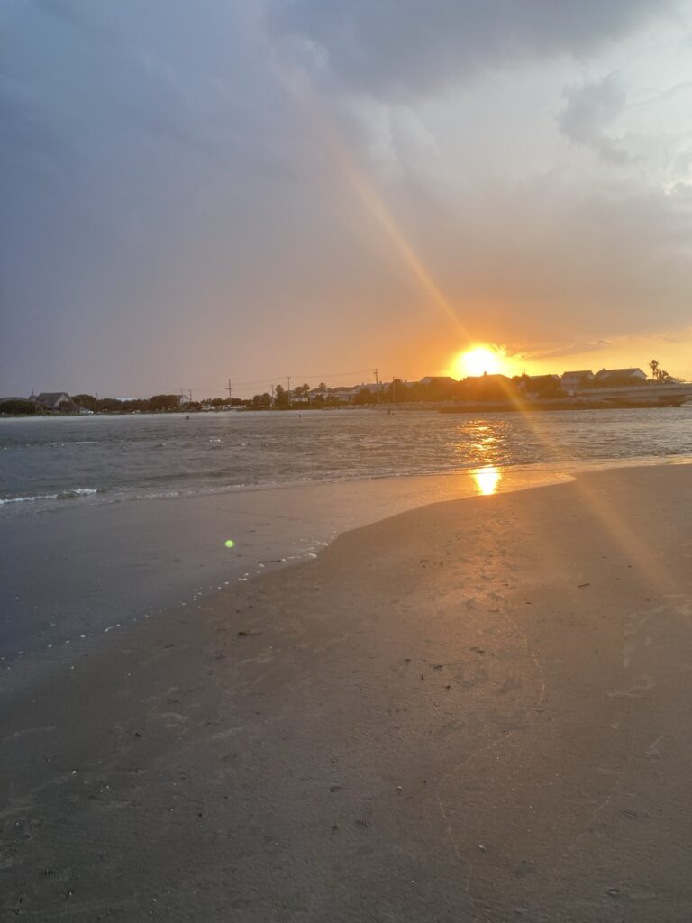
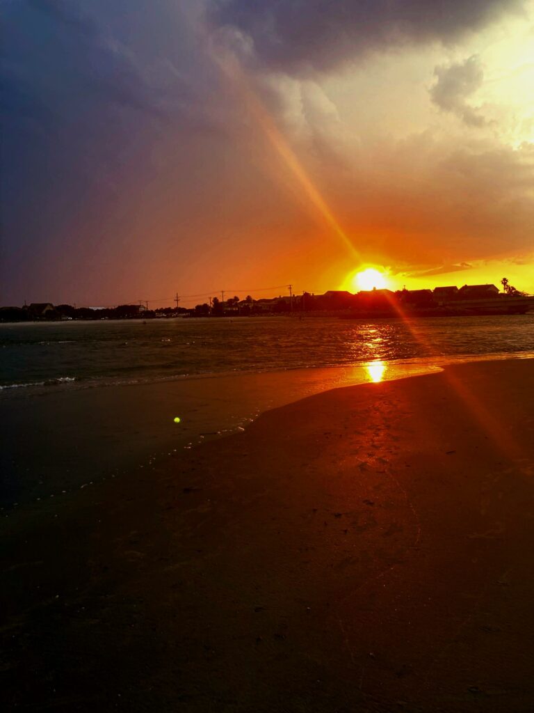
    What changes isn’t the shoreline; it’s the temperature of the light and the way the scene carries weight. In the first image, the sky leans blue and the sand reads neutral; good weather, typical for a beach day. In the second, warmth takes over. The sun streak turns amber, the wet sand glows, and the shadows deepen into near-black. By shifting color and contrast I pushed the scene from easy afternoon to a colorful dusk, and that one choice flips the narrative: from “nice walk” to “last light before a storm.”

    The exercise proved how color temperature and contrast dictate mood faster than a new subject ever could. The original says “nice evening.” The graded version says something about maybe “a new time” or “a new day.” Something interesting I may try next time is trying a cooler, de-saturated grade for a melancholy take, and a high-key grade for nostalgia, just to see how far the same frame can stretch!

    Colour is a power which directly influences the soul. -Wassily Kandinsky

    https://www.goodreads.com/author/quotes/155176.Wassily_Kandinsky

    The bottom line is that grading is story. The “before” records what the beach looked like; the “after” records how it felt to stand there with the wind picking up and the sun diving. Choosing between those versions is how I choose the emotion I want the viewer to carry away after seeing these images.

  • Summit at the Toy Pile

    It started as a normal patrol. Ollie rounded the table leg and paused at the foot of the toy pile; the Muppet council under high alert and suspicious. One photo later, I carved the moment into panels to show the five seconds of silent negotiation between them and him.

    Here’s a cowboy-standoff song you can play in the background to really set the scene of the story!

    Panel 1 sets the scene: Ollie enters from the left, body tall, investigating the council. Panel 2 cuts to the toys; their open mouths seemingly talking amongst themselves about the growing danger. They’re feared a coup is underway. Panel 3 and 4 are zoom in; a standoff between the two parties. Who gives way first? And lastly the 5th panel showcases the result; the Muppets hold their ground. The table is theirs for another day.

    The joke is small, but that’s why it works. Cropping one image into beats let me pace the moment like a comic: establish, reaction, tension, then the resolution. No speech bubbles were even needed to tell the story; just pictures! And to boot, one could interpret this comic in many different ways.

    While creating this comic, what really surprised me was how much story lives inside one still frame once you choose. The first tall shot does the heavy lifting, but the ear crop and the toy close-up sell the tension. Next time I’ll test a hero panel across the top with three smaller beats below, and I may add a single caption bar to time the punchline better!

  • Five Stars Over the Hill

    I wanted to see how little it takes to suggest a whole scene. With just a few marks, the house, the hill, and the night all clicked into place. It was as if my brain filled in the rest as I finished the drawing. I sketched the hill’s diagonal first, then dropped in the roofline, stars, and crescent until the frame felt balanced.

    Its a simple moment; a house tucked into a steep slope, a dark sky, and five soft stars in the distance. All of which is highlighted by the crescent moon. Now, there isn’t much detail on purpose; the emptiness is the point of this image.There are only three different shapes used here; 4 lines (That make up the house and the hill), 5 dots (The stars), and a single curve that represents the moon.

    The minimal night sky always makes me think of how a few shapes can carry a whole mood. If you want to see a maximal version of the same idea (sky as emotion)Maybe take a look at The Starry Night by the famous Vincent van Gogh. Notice how much the composition leans on simple curves and dots even there!
    https://en.wikipedia.org/wiki/The_Starry_Night

    Working inside the “4 lines, 5 dots, 1 curve” rule forced better choices. The long hill line became my anchor, the house lines gave the scene a place to rest, the five stars kept the eye moving, and the single curve sealed the mood without extra clutter. Next time I might shuffle the star positions into a looser constellation or thin the moon’s stroke, but I like how this version proves the point: a few intentional marks are enough to tell a whole story.

  • Ollie; Pillow Knight

    I was in the middle of playing a game called Hollow Knight, stuck in one of those quiet sections where the soundtrack shifts to a soft, almost classical theme. Ollie had curled himself into the pillow by my grandparents’ nightstand, ears tipped toward the TV like he was pretending not to listen. I was in a specific section of the game; one that played a soft, classical sounding soundtrack. Ollie really seemed to enjoy it as he seemingly struggled to stay awake as he listened.

    I don’t blame him either; this track specifically was incredibly peaceful and serene. If I wasn’t the one playing the game, I may have fallen asleep as well. In fact, here’s the exact soundtrack that played; you can listen to it as well to see just what I mean! After playing, you too may understand just how peaceful it was.

    I find it rare to find a moment in which Ollie pays attention to my gaming sessions, so I promptly took a picture of him. I grabbed my phone, framed the pillow and the edge of the nightstand so the scene felt quiet on purpose, and snapped the shot right before he finally let the sleep win. I then headed over to GIMP in order to further edit the scene. I felt as if making the image appear to be more of a drawing would fit more.

    In order to actually nudge the photo into a sketch, I ran a quick filter in GIMP. I used the Desaturate tool first, then utilized the Cartoon filter to ink the edges more. I tightened contrast with the Levels tool so the textures felt like pen on paper. The black-and-white, comic-leaning look matches the calm of the scene and keeps the focus on Ollie listening. Although it’s a small moment, I felt it’s exactly the kind that makes the drawing version feel right.