Category: Design Assignments

  • Catch of the Week

    This cover tells a small story: the day I landed a bass worth bragging about and finally had a photo that didn’t look like “the one that got away.” It’s the mix I really liked; little victory and a lure that actually did its job.

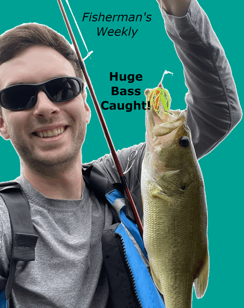
    For the layout, I cut myself out clean and dropped the portrait on a solid teal so the fish pops. The masthead sits up top where it belongs; the cover line is a blunt “Huge Bass Caught!” because that’s the hook. Type stays simple: one family, a couple sizes, high contrast. A soft background grounds the figure so it doesn’t float, and the rod line becomes a natural diagonal that adds to the fishing-theme.

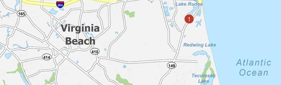
    If you want to grab an issue, here’s the location of the only shop that sells it!

    https://share.google/htj37FTSS3zaILDPS

    Covers are promises. This one promises a quick hit of why we fish: moments you can hold up with one hand and remember with both. Next time I’d add two smaller blurbs; bait choice and location conditions to sell the issue, but this shot already does most of the talking.

  • Beach Cookout Today

    This poster started as a text thread: “Grill at 3” No branding team, no committee; just friends, a shore, and a spatula! I wanted the poster to match that vibe: warm, obvious, zero pretension.

    I framed the grill close to make the food the star, then set it against a deep sand-gold field so the whole thing reads sunny even indoors. The headline is big and friendly, centered like a loud, clear invite. The details stay short; who, when, why to show up (free food).

    Here’s the location of the beach if you can attend!

    It’s not meant to live in a museum; it’s meant to work. You glance, you get it, you go. If I printed this, I’d keep the margins wide so it looks clean on a wall and add a tiny map link or QR in the corner. Everything else can stay simple; like the cookout.

  • Quiet Coast

    I made this poster after one of those weeks where the to-do list felt louder than the day itself. The shore that afternoon was anything but dramatic—no epic cliffs or thunderheads—just steady water, soft clouds, and a line of waves doing their thing. That’s exactly why I chose it. Calm on purpose.

    Design-wise, I blurred the far left and right edges to quiet the background chatter and pull your eye to the horizon. The line sits low so the sky can breathe, and the title lives along the sand where your eye lands last. It’s a simple black, bold, sentence-case line: plain language for a plain truth.

    Here’s some beach sounds I once recorded, so that you can really feel like you’re at the beach!

    The quote is mine because the moment felt personal: sometimes you don’t fix the noise; you let something bigger carry it out. If you’ve ever stood at the edge and felt your shoulders drop two inches, you know the feeling. That’s the whole poster—one small invite to step closer and let the tide do its work.

  • Design Blitz: Digital Safari

    Design is everywhere when you start looking! I went ahead and searched my arsenal of photos I’ve taken over the years to find which best spoke to various design features. These are all photos I took great pride in taking, but also ones that I feel best show off core ideas of design.

    DockPhoto

    Balance (Asymmetrical)

    The left third carries most of the weight: piling, ladder, and rod are dense verticals. The right side is mostly water/grass—negative space—which counterbalances the left without mirroring it. The diagonals of the railings lead the eye into the frame, then the vertical rod stops it. I thought the rod ironically made a really good divider in the center of the image, in order to truly see the “balance” of the image!

    Catphoto

    Dominance (Emphasis)

    A single dark shape on a light, low-contrast field immediately dominates. The abundance of white/gray space makes the pose feel relaxed, and the long stretch creates a directional line toward the face. Minimal background detail keeps attention directly on Ollie. In general, there’s no second guessing the fact that Ollie is the main subject in this image.

    OrangeSky

    Color (Mood)

    This shot rides a limited warm palette of oranges and ambers, which reads as calm/epic. The dark tree silhouettes act as a cool counterweight so the sky stays the story. It’s a good reminder that color alone can swing emotion without changing subject matter!

    SnowyArial

    Rhythm & Proportion

    Repetition makes rhythm: rows of rooftops, windows, and the roads. Seeing dozens of near-identical houses also showcases proportion; each unit is small against the overall grid.

    Conclusion

    This photo hunt proved that design is everywhere. Once I started looking, I could see what grabs attention, what feels balanced, and how color sets the mood. It doesn’t have to be fancy, but rather just clear choices. I’m going to keep that in mind: say what I want the viewer to notice, give it space, and pick colors on purpose.