This poster started as a text thread: “Grill at 3” No branding team, no committee; just friends, a shore, and a spatula! I wanted the poster to match that vibe: warm, obvious, zero pretension.
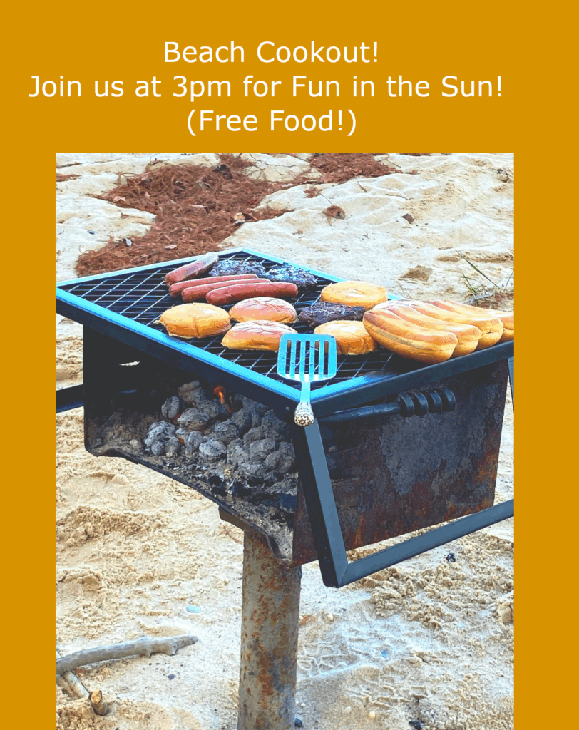
I framed the grill close to make the food the star, then set it against a deep sand-gold field so the whole thing reads sunny even indoors. The headline is big and friendly, centered like a loud, clear invite. The details stay short; who, when, why to show up (free food).
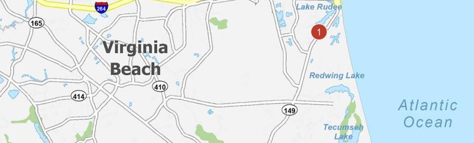
Here’s the location of the beach if you can attend!
It’s not meant to live in a museum; it’s meant to work. You glance, you get it, you go. If I printed this, I’d keep the margins wide so it looks clean on a wall and add a tiny map link or QR in the corner. Everything else can stay simple; like the cookout.
Leave a Reply